WHITE AND OAK HOUSE
Ground Floor re layout in North London
The Victorian House
Over the years, the House went through quite a few transformations. A tiny toilet squeezed under the stairs. New floors here and there, but the most significant change came with the addition of a new room at the rear facade. Unlike the original structure, this new extension blocked the views to the garden and seemed to disconnect the exterior from the interior. The purpose of this new room was not very clear, and its presence altered the flow and feel of the house. The lack of natural light, resulted in the dining room needing artificial light even during midday. Despite the extra square meters added by the new room, the layout became confused, and the garden lost all attention.
Brief
Ground Floor extension / Re-layout and re-design.
Location
North London
The Renovation
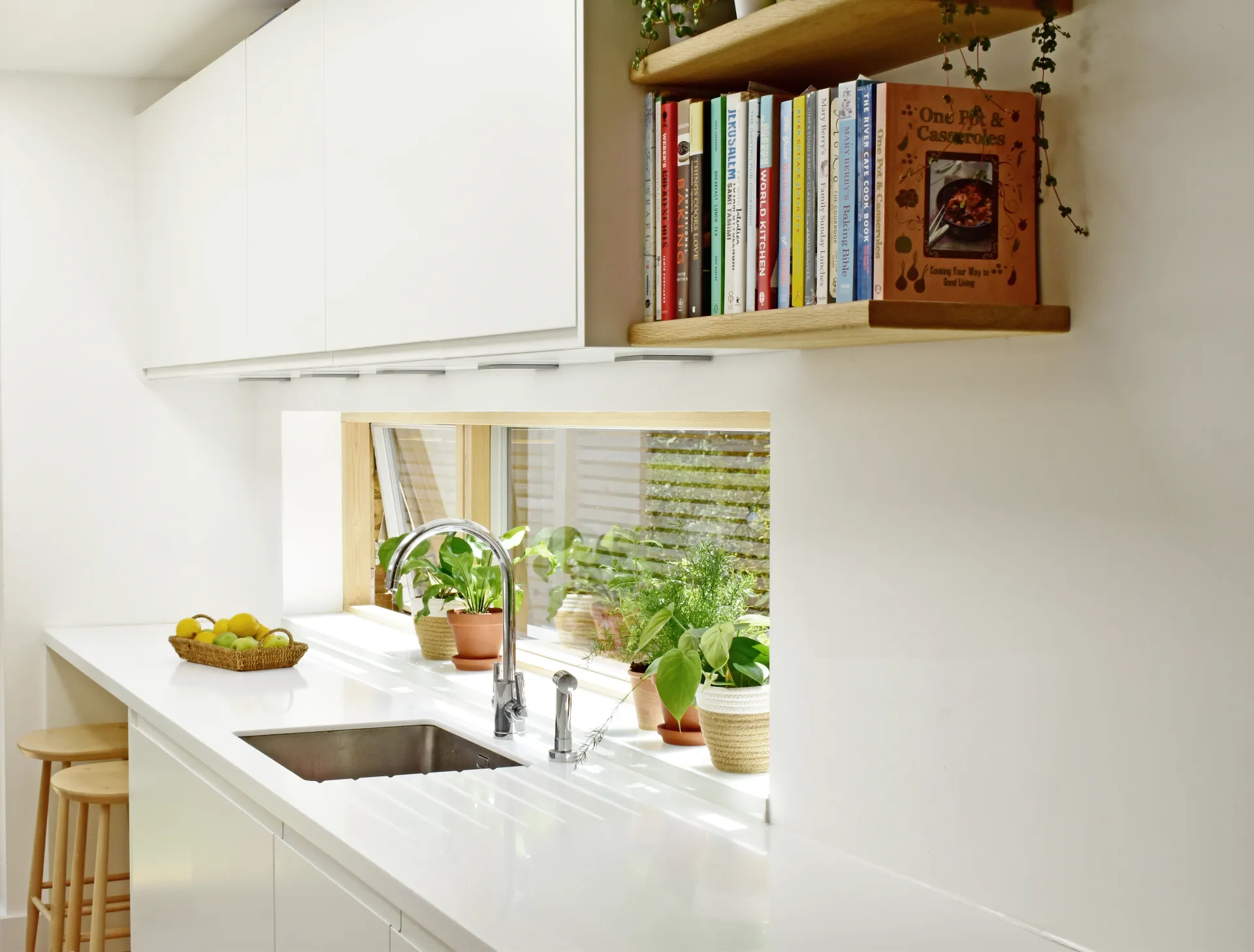
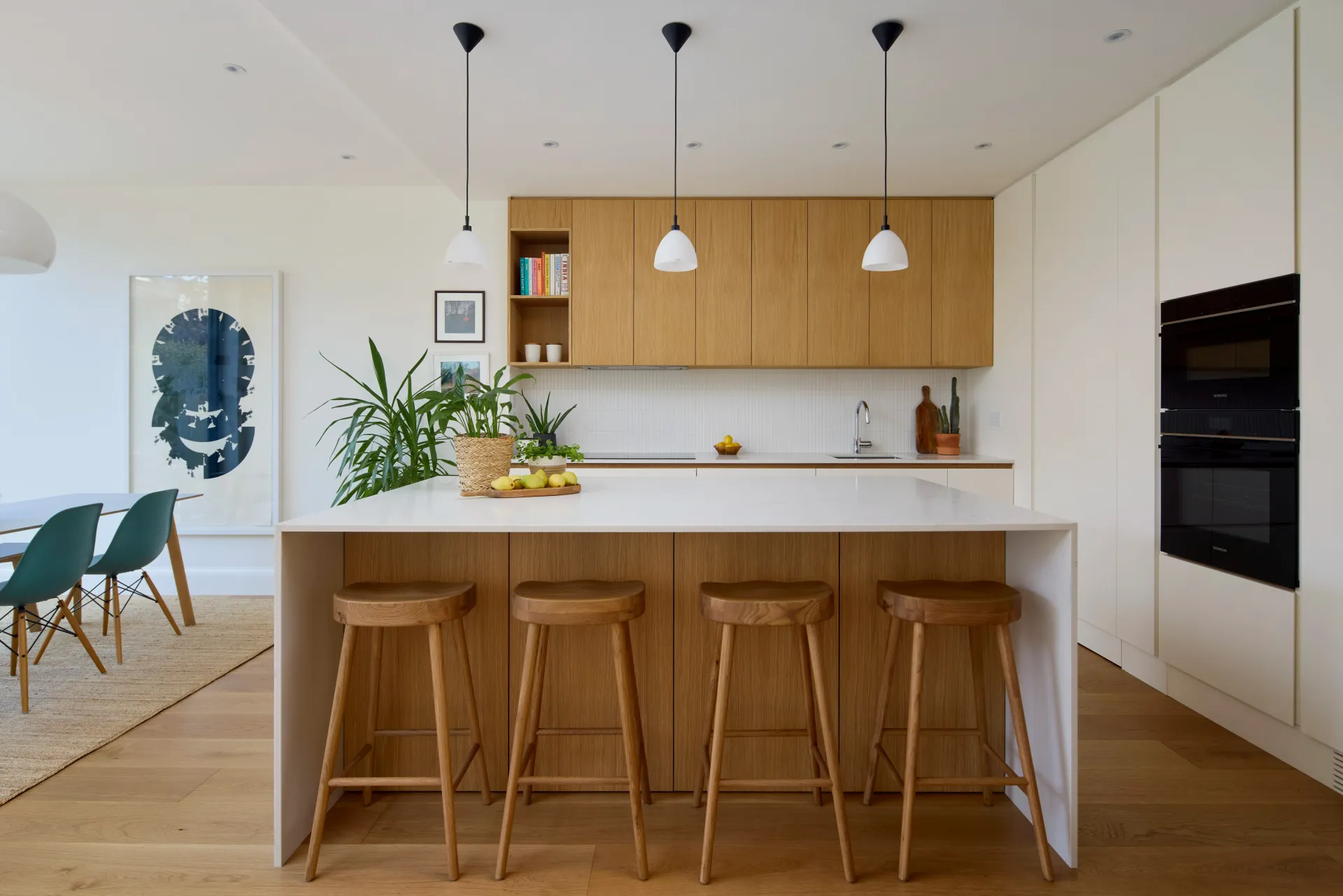
The House underwent a new transformation and re-layout, breathing new life into the old structure. The front room was reworked to operate independently, offering a quiet and cozy space, where the family can gather and enjoy the warmth of their new home. The rear rooms were opened up into an open plan with large windows that connected the interior to the garden, allowing natural light to flood the space. The once-confused layout now flowed seamlessly, creating a sense of harmony and openness within the home.


The white and wood
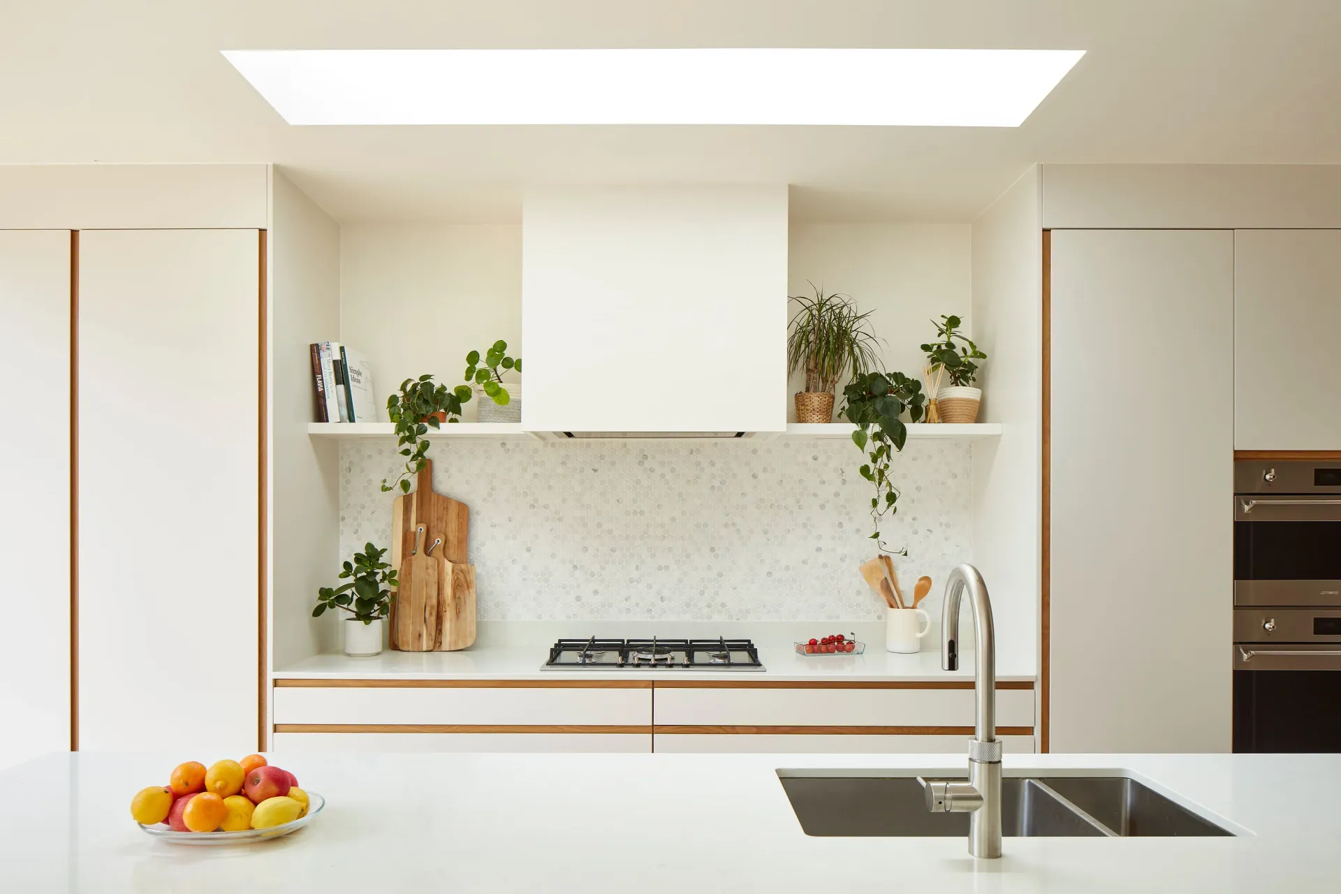
The selection of materials played a crucial role in the renovation. Throughout the entire ground floor, shades of whites and oaks filled the spaces, creating a sense of continuity and warmth. The white was artfully broken with touches of oak, and the oak, in turn, was balanced with white accents. Far from being boring, this harmonious blend of white and oak exuded a sense of calm, welcoming, and natural feeling. It provided a canvas for the family's collection of prints and objects gathered over the years – tangible memories of trips and gifts from loved ones. These items that goes beyond mere decoration but served as reminders of one family's identity and the experiences that shaped them.


The sense of the space
The existing and new ceilings have very good dimensions. However, to create a sense of even higher ceilings, we played with the vertical of the main elements: tall windows with vertical proportions and a bespoke kitchen with its floor-to-ceiling doors, adding a touch of elegance to the room. The ribs on the roof windows gently filtered the natural light, creating a warm and inviting glow throughout the day


The hidden utility
The small yet functional utility room was cleverly designed to seamlessly blend-in with the kitchen cabinet doors,effectively maximizing the use of space.


Featured Projects